My Profile
My Blog Posts
Awesome! This page is mobile-friendly
I’ve completed my brand new mobile-friendly personal blog yesterday. During this period i tried to implement Structured Data (schema.org) schemas and Mobile SEO best practices. Now it’s time to test these features working fully functional or not!
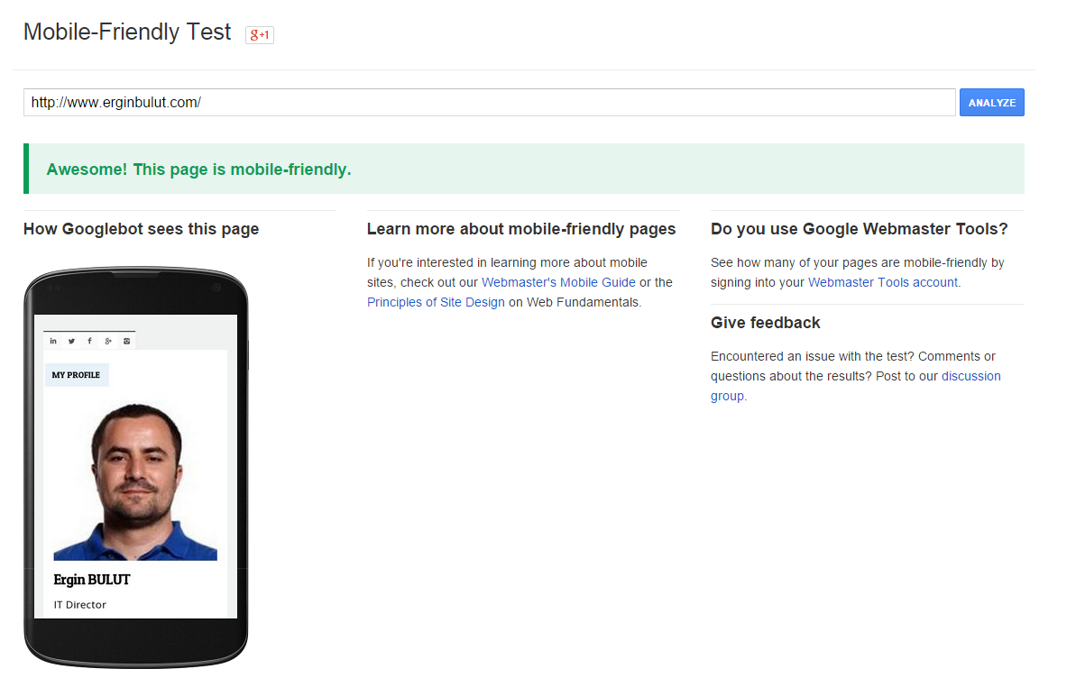
First step, visit Mobile-Friendly Test Tool, enter your website url and press the “Analyze” button to see the mobile-friendly page results. On my side, i got the result as below and yes, the blog is mobile friendly.
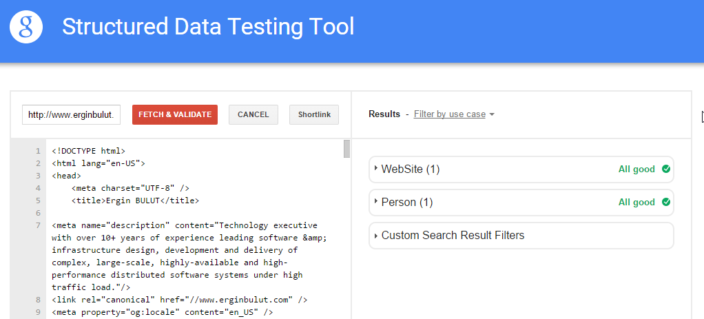
Second step, visit Structured Data Testing Tool, click the “Fetch Url” link and enter your website url then press the “Fetch & Validate” button to see the results. I got the results as below and it seems “Person” and “Website” schemas implemented successfully.
Google prefers responsive web design because content that lives on one website and one URL is much easier for users to share and interact with on different types of platforms such as desktop, tablet or mobile. Google is now placing on user-experience as a ranking factor, this is essential to take into account with regards to SEO.